You are using an out of date browser. It may not display this or other websites correctly.
You should upgrade or use an alternative browser.
You should upgrade or use an alternative browser.
All New Disunplugged Logo!
- Thread starter rteetz
- Start date
Look_Alive
Earning My Ears
- Joined
- Jan 17, 2018
- Messages
- 74
Xxx
Last edited:
Bobb_o
DIS Veteran
- Joined
- Jul 12, 2015
- Messages
- 574
(Don't like the Disneyland font or how the D extends outside of the screen. Also seems like the base of the antennae are 2/3 of a hidden Mickey.
It's just a logo though so whatever.
It's just a logo though so whatever.
disneysteve
DIS meet junkie
- Joined
- Sep 29, 2002
- Messages
- 16,200
Don't care for it myself. The old logo was modern and clean. This one just seems dated and disjointed. And using the Disneyland font doesn't encompass all that they do or cover. It's just a logo thankfully but I won't be buying the t-shirt.
ALWEASEL
Mouseketeer
- Joined
- Dec 28, 2005
- Messages
- 101
I like it. It makes it seems like TV in the logo says it's not just a website/podcast anymore. The new Disneyland font is new and like Look_alive said it's fresh and retro.
I'm a graphic and web designer and logo's are notoriously hard. Branding is very difficult but re branding is even harder. Everyone really got used to and loved the old logo.
I can understand what everyone is saying. But me i like it. I hope they talk about it on the show tomorrow.
Good job all and i can't wait to see it on products and on shows.
DisneyCowgirl
DIS Veteran
- Joined
- Jan 16, 2004
- Messages
- 3,049
love it!
TheMaxRebo
DIS Legend
- Joined
- Jan 12, 2008
- Messages
- 27,672
(Don't like the Disneyland font or how the D extends outside of the screen. Also seems like the base of the antennae are 2/3 of a hidden Mickey.
It's just a logo though so whatever.
must admit I didn't see it at first, but now it does sort of look like the TV is wearing a Mickey ear hat
The Orange Bird
Life Finds a Way!
- Joined
- Apr 11, 2017
- Messages
- 27
I dig it. I know a lot of folks don't like the classic Disneyland font since the focus of the show is on WDW but I don't mind. Also we have to remember that they did say there where some changes coming to the shows so I'd say lets be patient. Perhaps they have a plan. The folks at The Dis have been doing this for a while so trust them and lets see what happens.
Fireline
Earning My Ears
- Joined
- May 9, 2017
- Messages
- 48
I like it. The small details of logos can speak volumes about what a company is about. The “DIS” being Disneyland font shows a renewed connection to Dinsney land and not just World. I’m sure the D being outside the screen and the uneven antennae as well as the small jog back of the wire mean something in particular. Or not. But it’s fun to give meaning to them. I could speculate for hours.
- Joined
- Oct 30, 2001
- Messages
- 1,000,233
must admit I didn't see it at first, but now it does sort of look like the TV is wearing a Mickey ear hat
We would never put a Hidden Mickey in a logo.

TheMaxRebo
DIS Legend
- Joined
- Jan 12, 2008
- Messages
- 27,672
We would never put a Hidden Mickey in a logo.
*pfew* that makes me feel much better

TheMaxRebo
DIS Legend
- Joined
- Jan 12, 2008
- Messages
- 27,672
I mentioned in the other thread that I really like the logo as a logo - only thing is it gives me a very Retro vibe (especially the older style TV) and make me think that this would be a channel that covers the history of the parks more than current news and the current status of the parks
But I am sure we will get used to it ... and also mentioned in the other thread I really like the new intro style
But I am sure we will get used to it ... and also mentioned in the other thread I really like the new intro style
- Joined
- Oct 30, 2001
- Messages
- 1,000,233
Don't care for it myself. The old logo was modern and clean. This one just seems dated and disjointed. And using the Disneyland font doesn't encompass all that they do or cover. It's just a logo thankfully but I won't be buying the t-shirt.
Thank you! I enjoyed the last logo I worked on too, but it’s dated now and doesn’t represent how we’ve evolved or where we are going. Change is hard, whether it’s through design or restructure, but needs to happen to grow.
disneysteve
DIS meet junkie
- Joined
- Sep 29, 2002
- Messages
- 16,200
I agree that change is hard. And pleasing everyone is impossible. As I said, it's just a logo. What's behind the logo - people, content, passion - is far more important. I love the DIS. Whether or not I love the logo is irrelevant.Thank you! I enjoyed the last logo I worked on too, but it’s dated now and doesn’t represent how we’ve evolved or where we are going. Change is hard, whether it’s through design or restructure, but needs to happen to grow.
AnnMichele
Mouseketeer
- Joined
- Apr 28, 2017
- Messages
- 88
I love it! Great job, @WebmasterCorey!
- Joined
- Oct 30, 2001
- Messages
- 1,000,233
I mentioned in the other thread that I really like the logo as a logo - only thing is it gives me a very Retro vibe (especially the older style TV) and make me think that this would be a channel that covers the history of the parks more than current news and the current status of the parks
But I am sure we will get used to it ... and also mentioned in the other thread I really like the new intro style
Every time we tried to use the likeness of a 4k Visio or Samsung, it just didn't work. The Retro TV is a comical play on how modern and tech "the show" is going...
Last edited:
Mackenzie Click-Mickelson
Chugging along the path of life
- Joined
- Oct 23, 2015
- Messages
- 31,298
I like it and don't have any problem with it of it except for the font for the DIS part I'm not the biggest fan of.
I can imagine how trying to pick a Disney font if that was the route you wanted would be hard but to me that represents Disneyland not Disney company itself;that's just me.
I can imagine how trying to pick a Disney font if that was the route you wanted would be hard but to me that represents Disneyland not Disney company itself;that's just me.
TheMaxRebo
DIS Legend
- Joined
- Jan 12, 2008
- Messages
- 27,672
Every time we tried to use the likeness of a 4k Visio or Samsung, it just didn't work. The Retro TV is a comical play on how modern and tech "the show" is going...
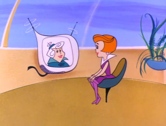
Makes sense - and as I look at it more, it also has a bit of a retro-future vibe to it ... and actually looked quick and it sort of looks like televisions the Jetsons had

And I think we can all agree (well, it's the internet so of course not) that the "retro-future" version of tomorrowland is the best
-
New Character Costumes at Goofy's Kitchen Celebrate Springtime at Disneyland Hotel
-
Animal Kingdom's Nomad Lounge: Favorite Drinks & The BEST Churros
-
Themes Revealed for 2026 runDisney Springtime Surprise Weekend at Disney World
-
Winnie the Pooh Pop-Up Arrives at Disney World This Weekend
-
10 Advantages for the Solo Disney Parks Traveler
-
A Unique Disneyland Souvenir You'll Actually Treasure
-
D23 2026: The Disney World Announcements to Watch
New Threads
- Replies
- 0
- Views
- 100
- Replies
- 2
- Views
- 305
- Replies
- 8
- Views
- 478
Disney Vacation Planning. Free. Done for You.

Our Authorized Disney Vacation Planners are here to provide personalized, expert advice, answer every question, and uncover the best discounts.
Let Dreams Unlimited Travel take care of all the details, so you can sit back, relax, and enjoy a stress-free vacation.
Start Your Disney Vacation

New Posts
Resort Thread
Disney's YACHT & BEACH CLUB Resorts
- Replies
- 45K
- Views
- 8M
- Replies
- 118
- Views
- 15K
- Replies
- 7
- Views
- 2K
